CHLOE BRACHT
PineCoffee
This was an exercise in Graphic design that I plan on expanding with product designs and packaging.
Will update in the near future.
Mark
Normally one would start with a mark, but given the idea I had I actually made the mark out off the more detailed image. This was what I deiced on, using the trees to make a minimalist mark to help sell the soft and welcoming environment.

Text
The text I based off of the simple and round design of the tree, resulting in the use of Arial Rounded MT Bold as the primary text.

Blends
The spilling coffee pot is where this whole idea started, with it some variation depending on the type of blend. I also did a zoomed and flipped version for smaller bags or products.

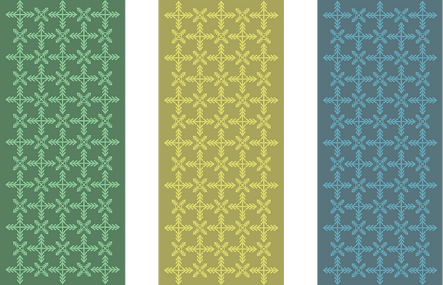
Patterns
Finally I had made some small pattern ideas that can be used alongside and can expand additional merchandise.